Pastel green
Hex Code, Palettes & Meaning
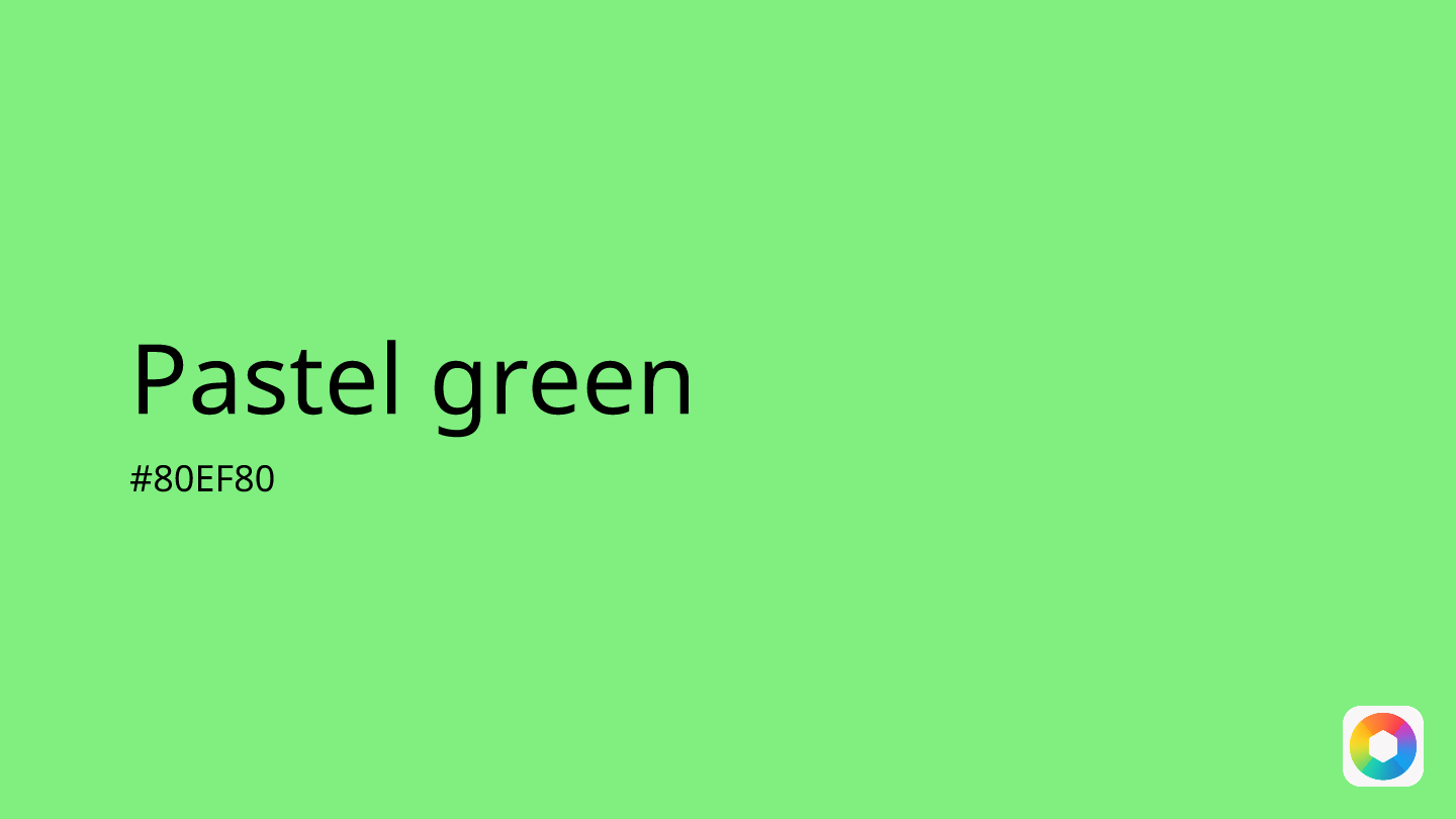
Pastel green (#80EF80) is a gentle, luminous shade that strikes the perfect balance between vibrancy and tranquility. This soft green hue captures the essence of spring mornings and fresh growth, making it an ideal choice for designs that need to feel both refreshing and calming.
In digital design, pastel green excels as a background color or accent that won't overwhelm users. Its psychological impact is powerful yet subtle—it evokes feelings of optimism, renewal, and serenity while maintaining enough brightness to capture attention. This makes it particularly effective for wellness apps, success messages, and eco-friendly brands.
Pastel green pairs beautifully with complementary colors like lilac for a spring-inspired palette, or coral pink for a modern, energetic combination. For a more sophisticated look, try pairing it with cream or crisp white.
Whether you're designing a meditation app interface or creating brand materials for a sustainable business, pastel green offers versatility without sacrificing visual appeal. Its gender-neutral appearance and strong associations with nature, growth, and freshness make it a reliable choice for designs that need to feel both contemporary and timeless.
Images with Pastel green color


Color Palettes
Complementary
Split
Monochromatic
Analogous
Triadic
Hex
#80EF80
RGB
128,239,128
HSB
120, 46%, 94%
HSL
120, 78%, 72%
Other Colors
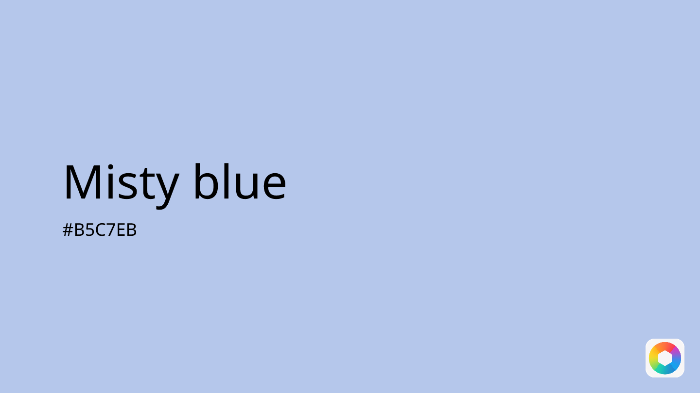
Misty blue
Explore the qualities of Misty blue.
Learn more
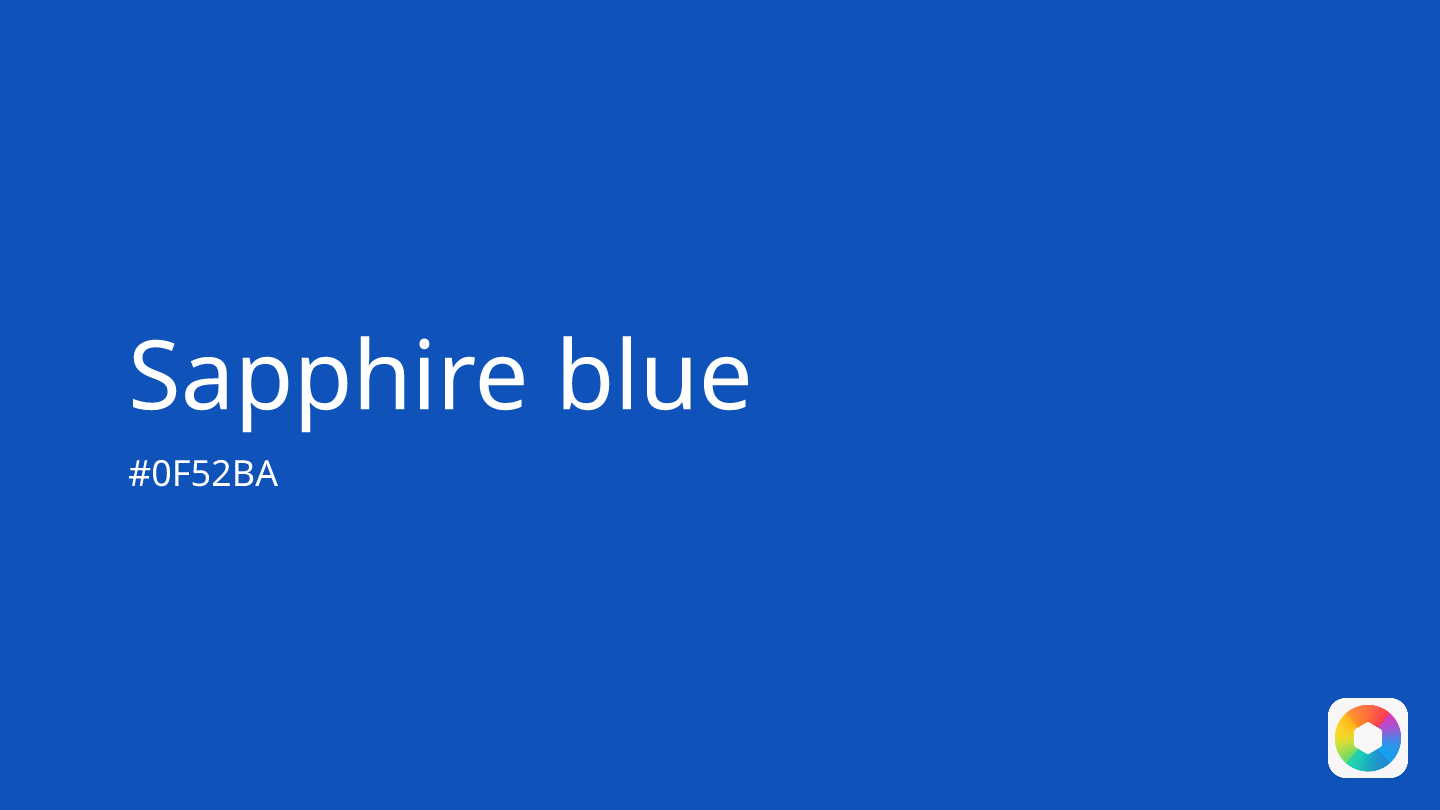
Sapphire blue
Explore the qualities of Sapphire blue.
Learn more
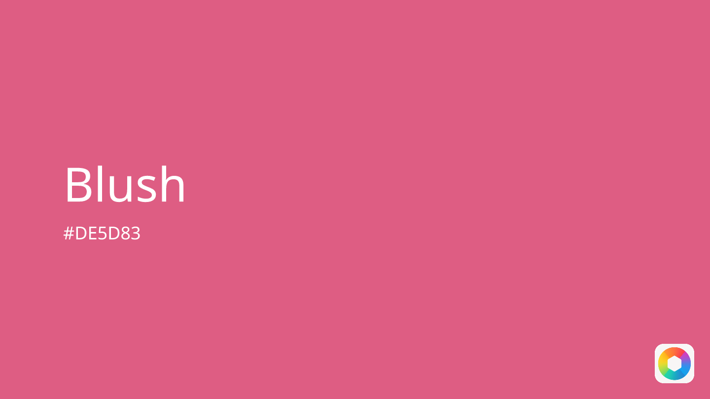
Blush
Explore the qualities of Blush.
Learn more
Oatmeal
Explore the qualities of Oatmeal.
Learn more
Seafoam
Explore the qualities of Seafoam.
Learn more
Viridian
Explore the qualities of Viridian.
Learn more