Oatmeal
Hex Code, Palettes & Meaning
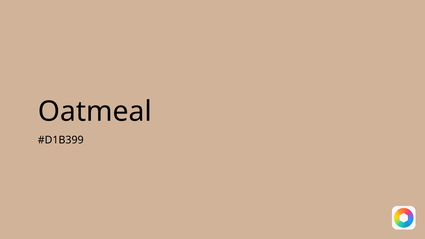
Oatmeal (#D1B399) is a warm, calming neutral that sits perfectly between beige and tan on the color spectrum. This versatile shade draws its name from ground oats, embodying the same nourishing, comforting qualities that make it a designer favorite.
The color's soft, creamy undertones create an inviting atmosphere that promotes relaxation and tranquility. Unlike cooler neutrals, oatmeal adds gentle warmth to any space, making it ideal for creating cozy, welcoming environments. Interior designers particularly value its ability to serve as a sophisticated backdrop that allows other colors to shine while maintaining visual harmony.
In fashion, oatmeal has emerged as a contemporary alternative to traditional neutrals, offering more warmth than gray while remaining more subtle than cream. It pairs beautifully with earthy tones like rust, sage, and terracotta, as well as soft pastels.
For digital designers, oatmeal works exceptionally well in minimalist interfaces, providing sufficient contrast for readability while maintaining a soothing user experience. However, avoid pairing it with overly vibrant colors like neon orange or hot pink, which can create jarring contrasts that diminish its calming effect.
Images with Oatmeal color


Color Palettes
Complementary
Split
Monochromatic
Analogous
Triadic
Hex
#D1B399
RGB
209,179,153
HSB
28, 27%, 82%
HSL
28, 38%, 71%
Other Colors
Pearl
Explore the qualities of Pearl.
Learn more
Evergreen
Explore the qualities of Evergreen.
Learn more
Dark blue
Explore the qualities of Dark blue.
Learn more
Glaucous
Explore the qualities of Glaucous.
Learn more
Parchment
Explore the qualities of Parchment.
Learn more
Light green
Explore the qualities of Light green.
Learn more