Eucalyptus
Hex Code, Palettes & Meaning
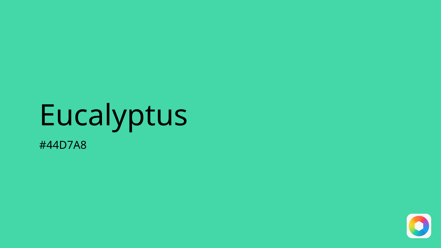
Eucalyptus (#44D7A8) captures the tranquil essence of nature with its distinctive gray-green hue. This calming color sits perfectly between green and gray on the color wheel, offering a sophisticated muted tone that evokes serenity and renewal.
In design, eucalyptus creates an instant connection to nature while maintaining a refined, contemporary feel. Its soft, airy quality makes it ideal for wellness brands, spa designs, and minimalist aesthetics. The color works beautifully in both digital interfaces and print materials, providing excellent readability when paired thoughtfully.
For harmonious combinations, pair eucalyptus with blush pink for romantic warmth, peach for gentle contrast, or slate gray for sophisticated neutrality. Mint green and seafoam create cohesive natural palettes, while bronze adds elegant metallic accents.
Avoid pairing eucalyptus with overly bold colors like crimson red or burnt orange, which can overpower its gentle, therapeutic nature. This versatile shade works particularly well in wellness, beauty, and lifestyle branding where calm sophistication is key.
Images with Eucalyptus color


Color Palettes
Complementary
Split
Monochromatic
Analogous
Triadic
Hex
#44D7A8
RGB
68,215,168
HSB
161, 68%, 84%
HSL
161, 65%, 55%
Other Colors
Raspberry
Explore the qualities of Raspberry.
Learn more
Razzmatazz
Explore the qualities of Razzmatazz.
Learn more
Wine
Explore the qualities of Wine.
Learn more
Sand dollar
Explore the qualities of Sand dollar.
Learn more
Silver
Explore the qualities of Silver.
Learn more
Oxblood
Explore the qualities of Oxblood.
Learn more