Cerise
Hex Code, Palettes & Meaning
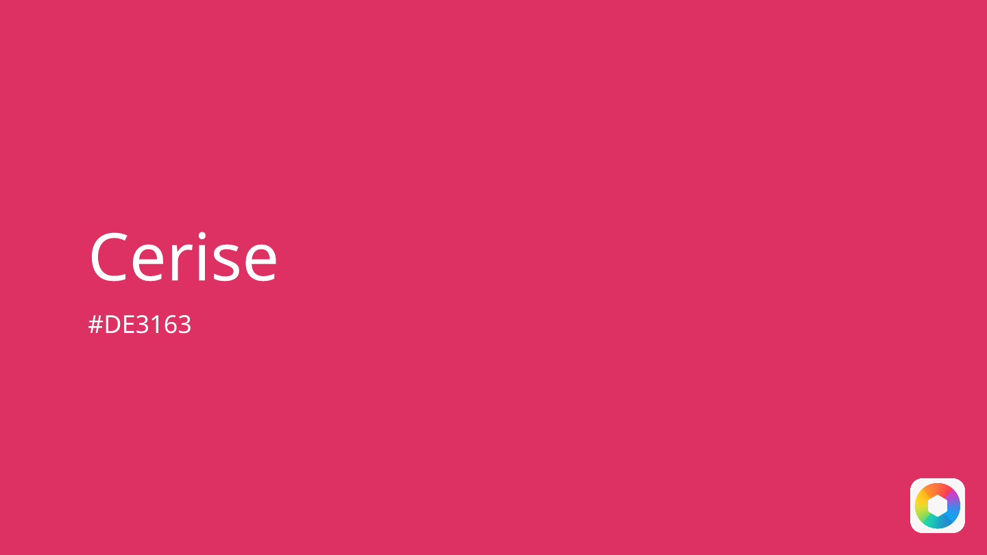
Cerise (#DE3163) is a vibrant pink-red color named after the French word for "cherry." This energetic hue sits beautifully between pink and red on the color spectrum, creating a bold shade that commands attention.
Color Psychology & Meaning Cerise embodies passion, confidence, and creativity. Its psychological impact combines red's intensity with pink's warmth, making it ideal for brands targeting youthful audiences or conveying empowerment. The color stimulates excitement and encourages self-expression, which is why it's frequently chosen for fashion statements and modern design themes.
Design Applications In design, cerise works exceptionally well as an accent color rather than a dominant shade. It pairs beautifully with neutrals like light gray and champagne, creating sophisticated yet playful palettes. For complementary schemes, consider mint green or powder blue to balance its intensity.
Similar Colors Cerise shares DNA with fuchsia, magenta, and raspberry, though it maintains its unique cherry-inspired character. Avoid pairing it with bright red or mustard yellow, as these create visual competition.
Whether used in fashion, branding, or interior design, cerise delivers energy and sophistication in perfect harmony.
Color Palettes
Complementary
Split
Monochromatic
Analogous
Triadic
Hex
#DE3163
RGB
222,49,99
HSB
343, 78%, 87%
HSL
343, 72%, 53%
Other Colors
Alabaster white
Explore the qualities of Alabaster white.
Learn more
Tan
Explore the qualities of Tan.
Learn more
Claret
Explore the qualities of Claret.
Learn more
Radical red
Explore the qualities of Radical red.
Learn more
Dark magenta
Explore the qualities of Dark magenta.
Learn more
Blush pink
Explore the qualities of Blush pink.
Learn more


