Raspberry
Hex Code, Palettes & Meaning
Raspberry (#E30B5D) strikes the perfect balance between red's passion and pink's playfulness, creating a sophisticated hue that commands attention without being overwhelming. This vibrant color captures the essence of the summer fruit it's named after—both sweet and tart, bold yet refined.
In design psychology, raspberry evokes warmth, creativity, and energy. It's an excellent choice for brands wanting to convey innovation and confidence, while in interior design it adds dramatic flair as an accent color against neutral palettes. The color works particularly well in fashion, where it complements various skin tones and can transition from casual to formal settings.
Raspberry pairs beautifully with its complement sea green for high contrast, or harmonizes with coral and peach for warm, inviting combinations. For a more sophisticated palette, try pairing it with cream, gold, or lavender.
Composed of 89% red, 4% green, and 36% blue in RGB values, raspberry has been used as a color name since the late 1800s. Its rich saturation (90.8%) and moderate lightness (46.7%) make it versatile enough for both digital and print applications, ensuring consistent reproduction across different media while maintaining its distinctive character.
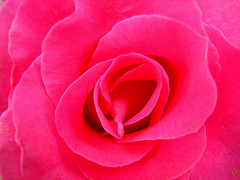
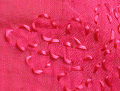
Images with Raspberry color


Color Palettes
Complementary
Split
Monochromatic
Analogous
Triadic
Hex
#E30B5D
RGB
227,11,93
HSB
337, 95%, 89%
HSL
337, 91%, 47%
Other Colors
Viridian
Explore the qualities of Viridian.
Learn more
Soft pink
Explore the qualities of Soft pink.
Learn more
Marigold
Explore the qualities of Marigold.
Learn more
Canary
Explore the qualities of Canary.
Learn more

Seashell
Explore the qualities of Seashell.
Learn more
Lemon
Explore the qualities of Lemon.
Learn more