Pastel purple
Hex Code, Palettes & Meaning
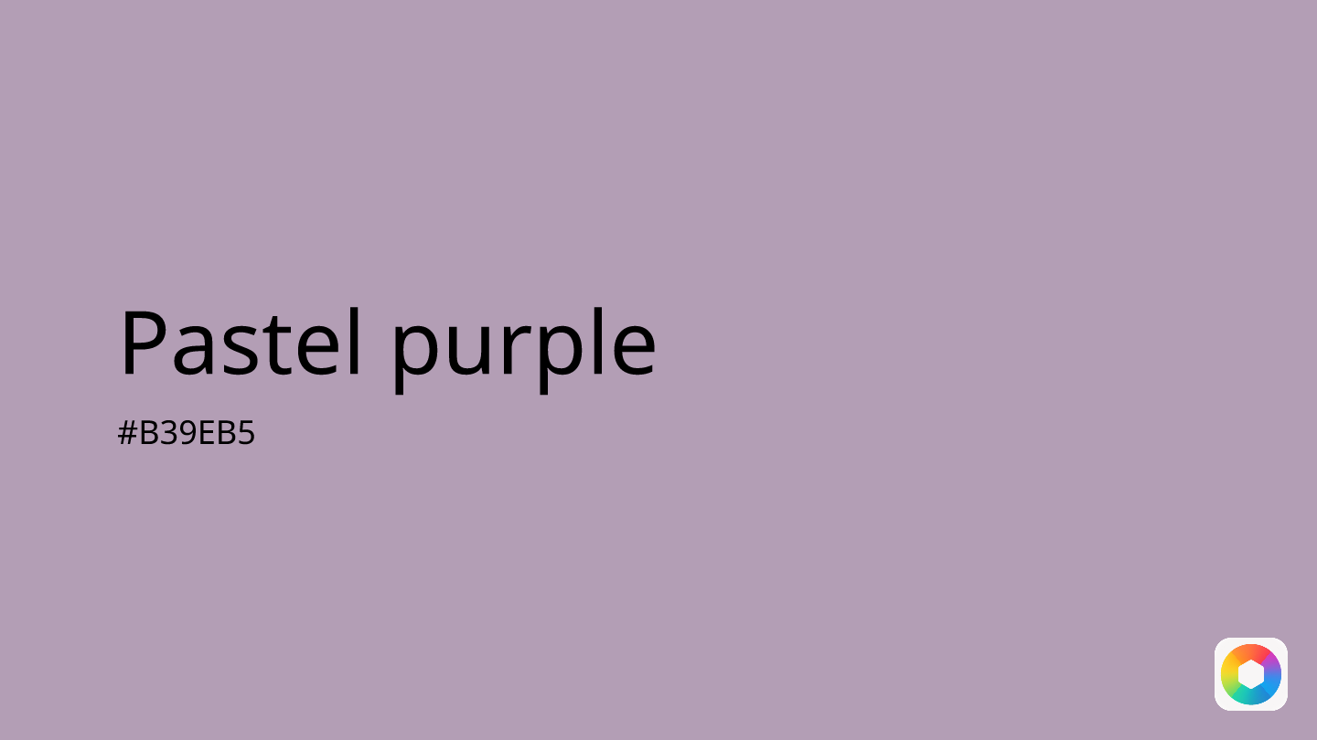
Pastel purple (#B39EB5) is a gentle, sophisticated hue that combines the calming nature of blue with the creativity of red. This soft shade sits beautifully between lavender and lilac on the color spectrum, offering a muted elegance that feels both timeless and contemporary.
In design, pastel purple works wonderfully as a primary color for brands seeking to convey luxury without overwhelming boldness. Its RGB values (179, 158, 181) create a perfectly balanced tone that pairs beautifully with neutrals like cream, ivory, or light gray. For complementary schemes, consider pairing it with pastel green or pastel yellow for a fresh, harmonious palette.
This versatile color is particularly effective in wellness, beauty, and creative industries where sophistication meets approachability. Unlike deeper purples that command attention, pastel purple whispers rather than shouts, making it ideal for backgrounds, subtle accents, or creating calm, inviting user interfaces. Whether you're designing for digital platforms or print materials, this shade brings an air of refined tranquility to any project.
Images with Pastel purple color


Color Palettes
Complementary
Split
Monochromatic
Analogous
Triadic
Hex
#B39EB5
RGB
179,158,181
HSB
295, 13%, 71%
HSL
295, 13%, 66%
Other Colors
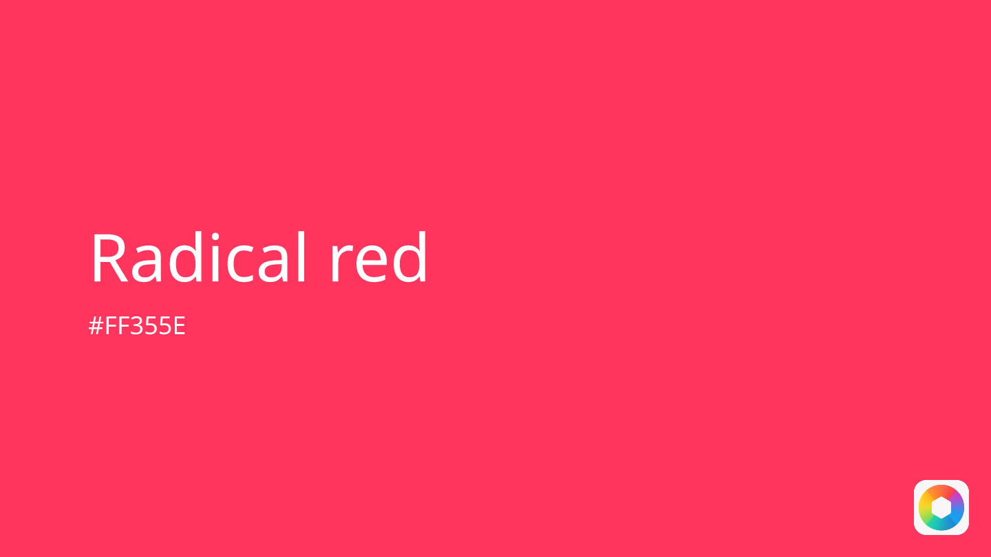
Radical red
Explore the qualities of Radical red.
Learn more
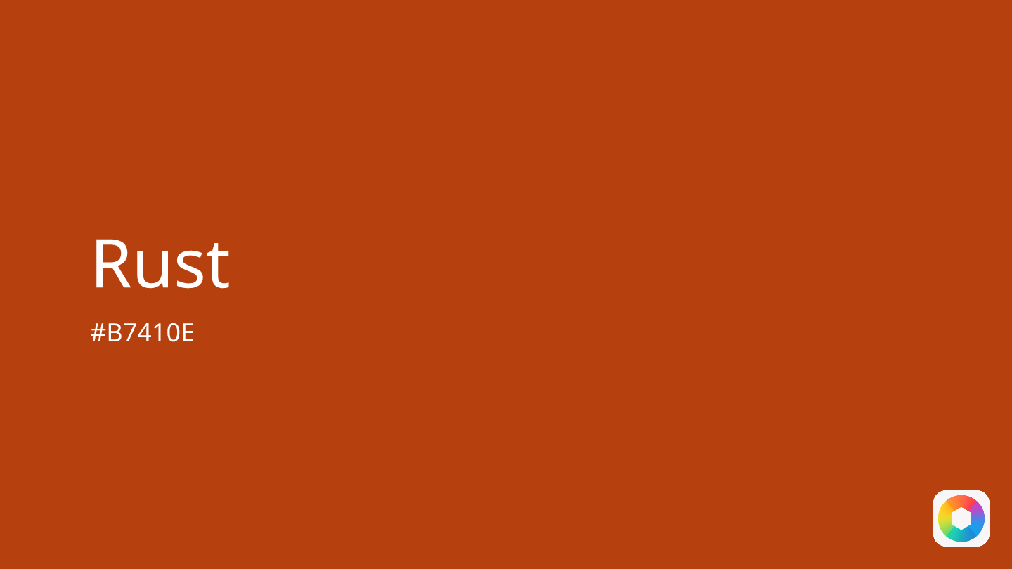
Rust
Explore the qualities of Rust.
Learn more
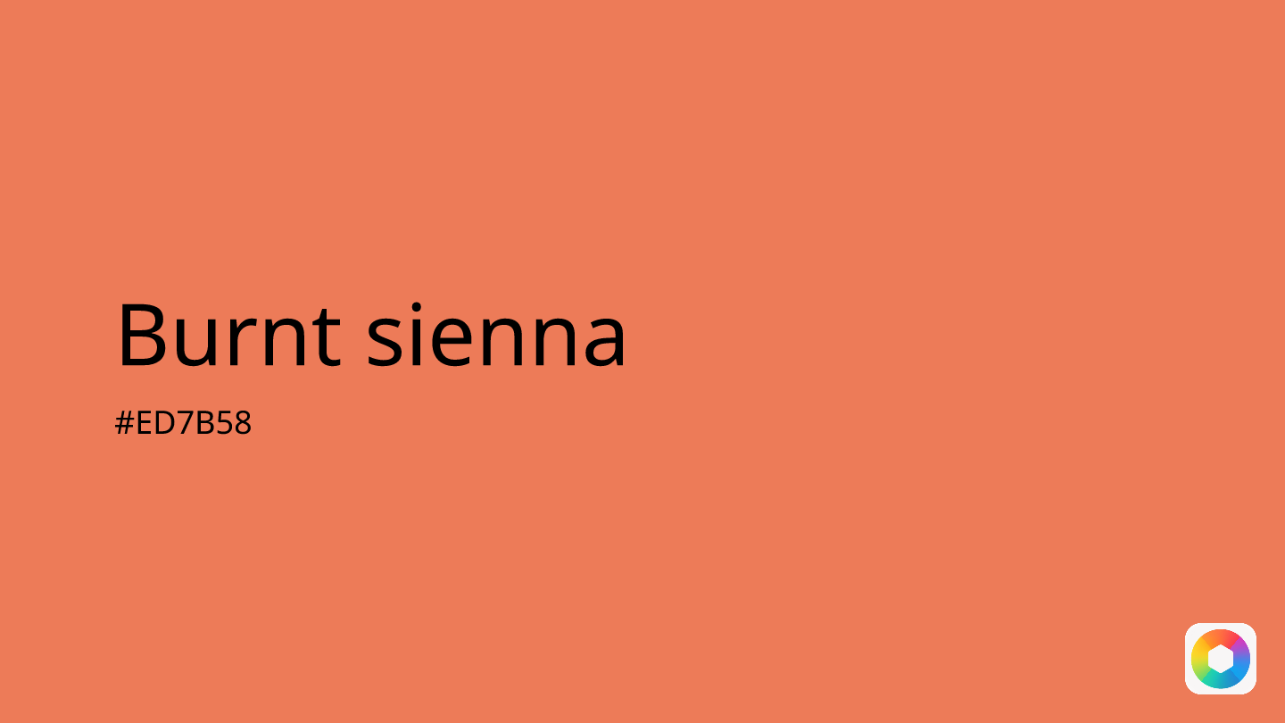
Burnt sienna
Explore the qualities of Burnt sienna.
Learn more
Sand dollar
Explore the qualities of Sand dollar.
Learn more
Dark green
Explore the qualities of Dark green.
Learn more

Khaki
Explore the qualities of Khaki.
Learn more