Pastel yellow
Hex Code, Palettes & Meaning
Pastel yellow (#FFEE8C) strikes the perfect balance between warmth and subtlety, creating a gentle hue that brings tranquility and cheerfulness to any design. This soft shade is created by mixing white into pure yellow, resulting in a delicate color that's both inviting and sophisticated.
In UI/UX design, pastel yellow excels as an accent color, adding visual depth without overwhelming users. Its soft warmth conveys friendliness and positivity, making it ideal for creating approachable interfaces and minimalist designs. Unlike its brighter yellow counterpart, pastel yellow offers excellent readability when used thoughtfully as backgrounds or subtle highlights.
This versatile shade pairs beautifully with complementary colors like periwinkle for whimsical designs, baby blue for serene spring-like palettes, or coral for fresh, citrusy combinations. For a more neutral approach, consider pairing it with ivory or light gray.
Pastel yellow works particularly well in baby products, wellness apps, and creative platforms where you want to inspire optimism without demanding attention. Remember that this pale hue requires careful contrast consideration for accessibility—while beautiful as a background or accent, it may not work well for text on light backgrounds.
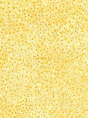
Images with Pastel yellow color


Color Palettes
Complementary
Split
Monochromatic
Analogous
Triadic
Hex
#FFEE8C
RGB
255,238,140
HSB
51, 45%, 100%
HSL
51, 100%, 77%
Other Colors
Honeysuckle
Explore the qualities of Honeysuckle.
Learn more
Ruby red
Explore the qualities of Ruby red.
Learn more
Dark violet
Explore the qualities of Dark violet.
Learn more
Dusty rose
Explore the qualities of Dusty rose.
Learn more
Pastel purple
Explore the qualities of Pastel purple.
Learn more
Magenta
Explore the qualities of Magenta.
Learn more