Pastel red
Hex Code, Palettes & Meaning
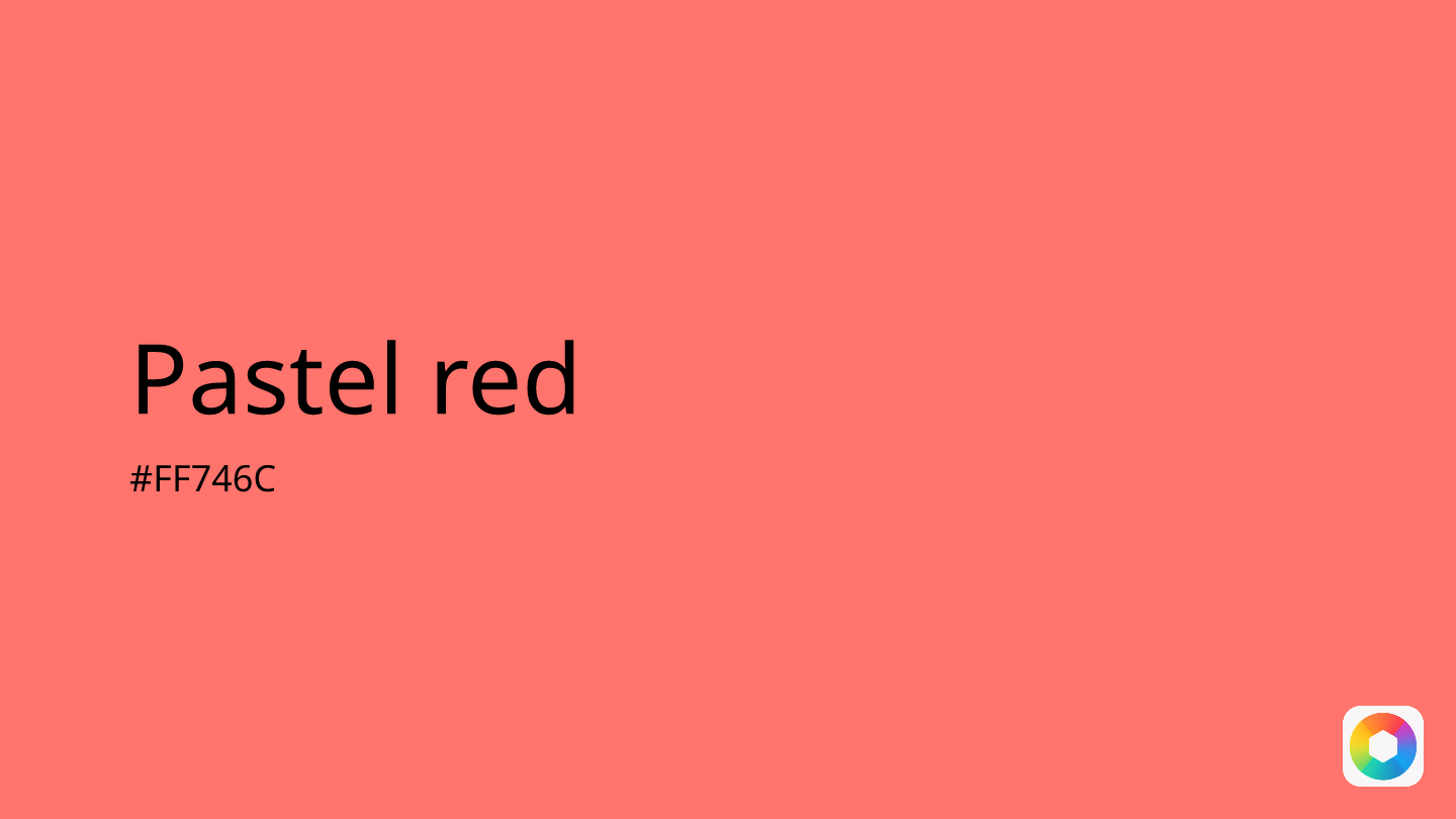
Pastel red (#FF746C) strikes the perfect balance between warmth and tranquility, offering a softer alternative to traditional bold reds. This dreamy, muted shade combines the energy of red with the gentle lightness of pastels, making it ideal for creating welcoming and soothing digital experiences.
With RGB values of 255, 116, 108, pastel red evokes romance and peace while maintaining visual appeal. Unlike its vibrant cousins, this hue represents openness and positivity without overwhelming the viewer. It works beautifully as an accent color for buttons, interactive elements, or to highlight important content subtly.
Pastel red pairs harmoniously with teal, mint green, lavender, and light gray, creating sophisticated color palettes. For a monochromatic approach, consider combining it with coral, salmon, or dusty rose.
Designers appreciate pastel red for its versatility across both light and dark backgrounds, making it perfect for modern UI design where accessibility and visual comfort are priorities. Whether you're designing apps focused on wellness, romance, or simply need a gentle yet engaging accent color, pastel red delivers warmth without intensity.
Images with Pastel red color


Color Palettes
Complementary
Split
Monochromatic
Analogous
Triadic
Hex
#FF746C
RGB
255,116,108
HSB
3, 58%, 100%
HSL
3, 100%, 71%
Other Colors
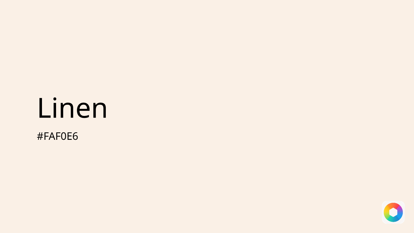
Linen
Explore the qualities of Linen.
Learn more
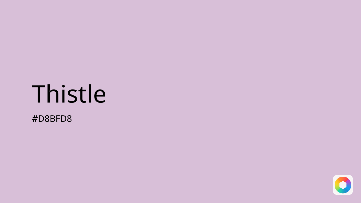
Thistle
Explore the qualities of Thistle.
Learn more
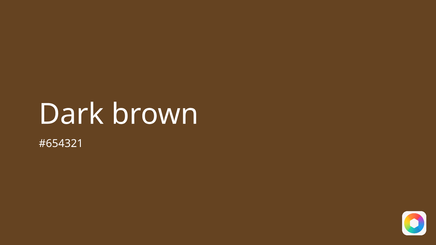
Dark brown
Explore the qualities of Dark brown.
Learn more
Dusty rose
Explore the qualities of Dusty rose.
Learn more
Yellow-orange
Explore the qualities of Yellow-orange.
Learn more
Burnt orange
Explore the qualities of Burnt orange.
Learn more