Serenity
Hex Code, Palettes & Meaning
Serenity (#B3CEE5) is a soft, muted blue-gray that earned recognition as Pantone's Color of the Year 2016 alongside Rose Quartz. This sophisticated shade combines the calming properties of blue with the neutrality of gray, creating a color that naturally reduces stress and promotes mental clarity.
With RGB values of 179, 206, 229, Serenity sits beautifully between powder blue and periwinkle on the color spectrum. Research shows this gentle hue can actually lower blood pressure and reduce stress responses, making it ideal for wellness-focused designs and spaces meant for relaxation.
Serenity pairs exceptionally well with rose quartz for a balanced, nurturing palette. It also harmonizes beautifully with lavender, sage, and silver for sophisticated combinations. For contrast, try pairing it with warm gold or peach accents.
Whether you're designing a meditation app, bedroom decor, or brand identity focused on wellness, Serenity delivers an instant sense of tranquility and balance that feels both contemporary and timeless.
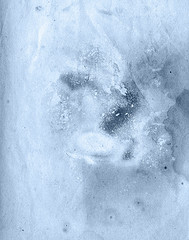
Images with Serenity color


Color Palettes
Complementary
Split
Monochromatic
Analogous
Triadic
Hex
#B3CEE5
RGB
179,206,229
HSB
208, 22%, 90%
HSL
208, 49%, 80%
Other Colors
Puce
Explore the qualities of Puce.
Learn more
Malachite
Explore the qualities of Malachite.
Learn more
Sunset orange
Explore the qualities of Sunset orange.
Learn more
Maroon
Explore the qualities of Maroon.
Learn more
Slate gray
Explore the qualities of Slate gray.
Learn more
Olive green
Explore the qualities of Olive green.
Learn more