Pastel orange
Hex Code, Palettes & Meaning
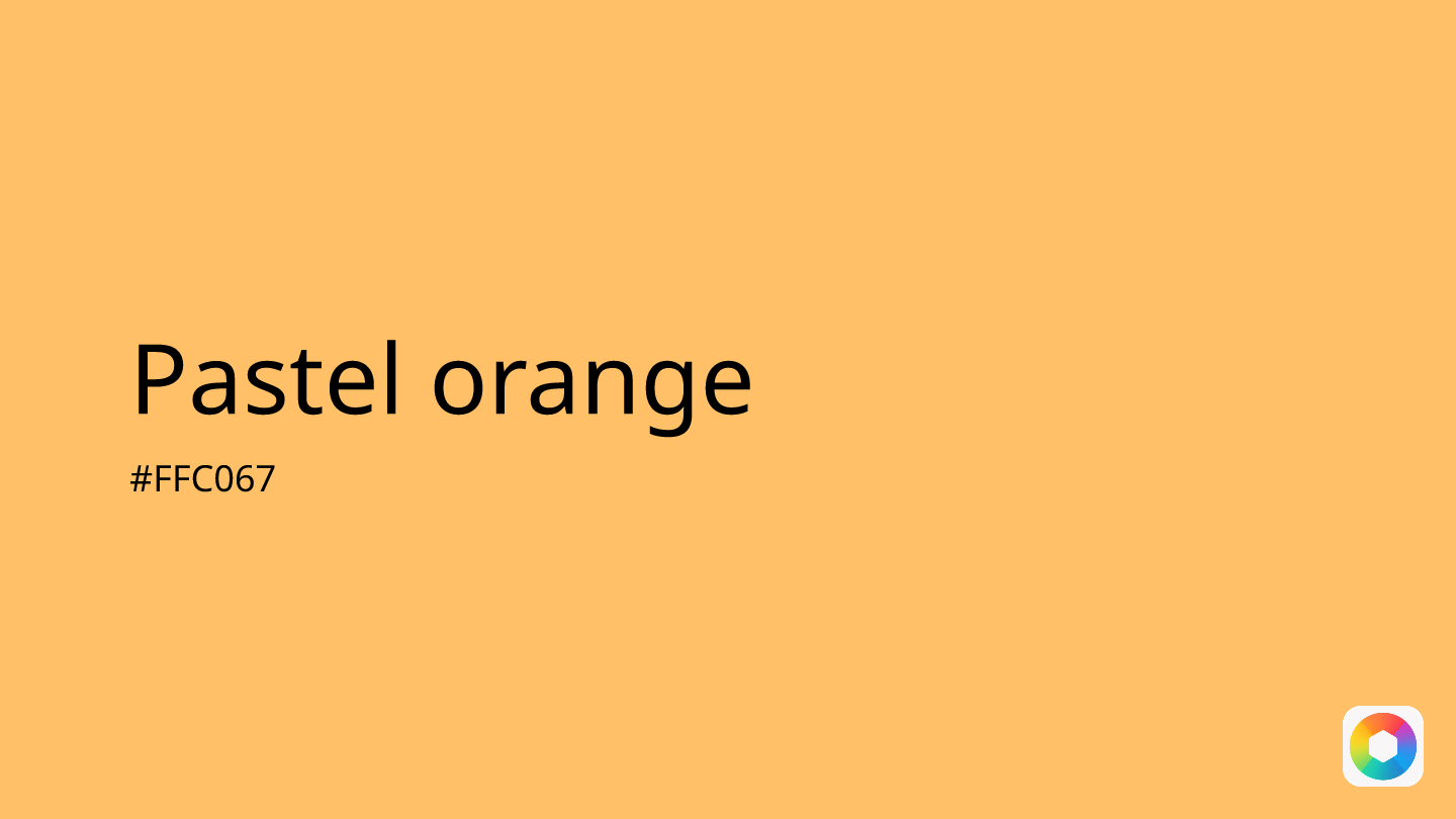
Pastel orange (#FFC067) strikes the perfect balance between warmth and tranquility, making it a designer's secret weapon for creating approachable, calming interfaces. This gentle hue combines orange's energetic spirit with the softness of pastel tones, resulting in a color that evokes relaxation and optimism without overwhelming the viewer.
With RGB values of 255, 192, 103, this warm shade works brilliantly for wellness apps, travel websites, and social platforms where you want to create an inviting atmosphere. Unlike its bolder cousin orange, pastel orange provides subtle visual interest while maintaining excellent readability when paired with darker elements.
For color combinations, pastel orange harmonizes beautifully with mint green for a fresh, balanced palette, or cream for an elegant, monochromatic scheme. It also pairs surprisingly well with teal for modern, energetic designs.
The key to using #FFC067 effectively lies in restraint – it shines as an accent color for buttons, highlights, or gentle backgrounds rather than dominating entire layouts. This makes it perfect for brands seeking to convey friendliness and creativity while maintaining professional credibility.
Whether you're designing a meditation app or a creative portfolio, pastel orange offers the warmth of a sunset with the gentleness of dawn, creating spaces that feel both energizing and peaceful.
Images with Pastel orange color


Color Palettes
Complementary
Split
Monochromatic
Analogous
Triadic
Hex
#FFC067
RGB
255,192,103
HSB
35, 60%, 100%
HSL
35, 100%, 70%
Other Colors
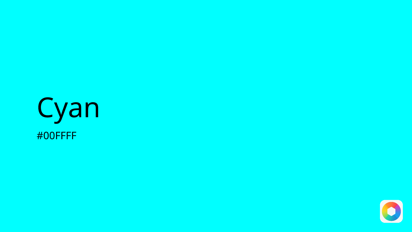
Cyan
Explore the qualities of Cyan.
Learn more
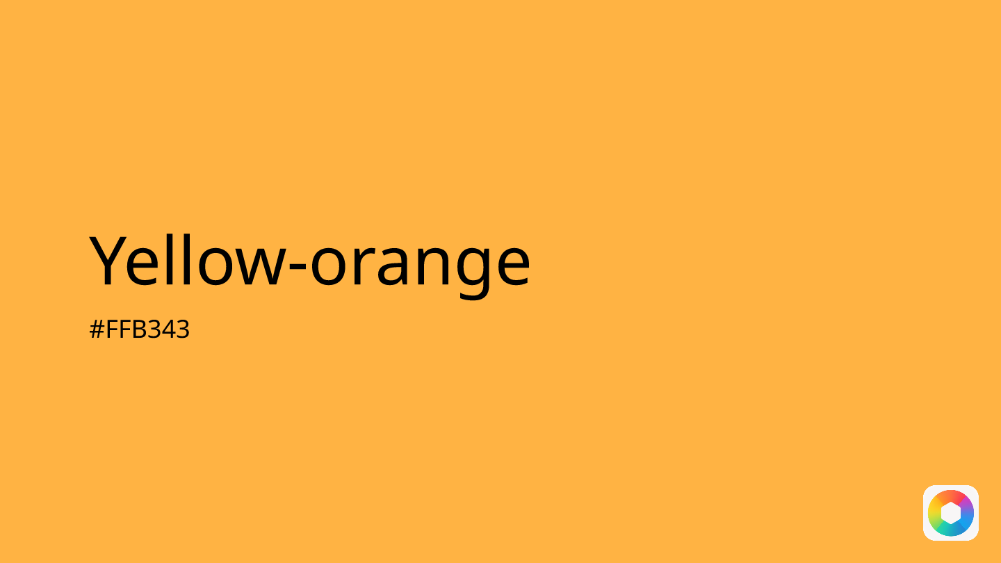
Yellow-orange
Explore the qualities of Yellow-orange.
Learn more
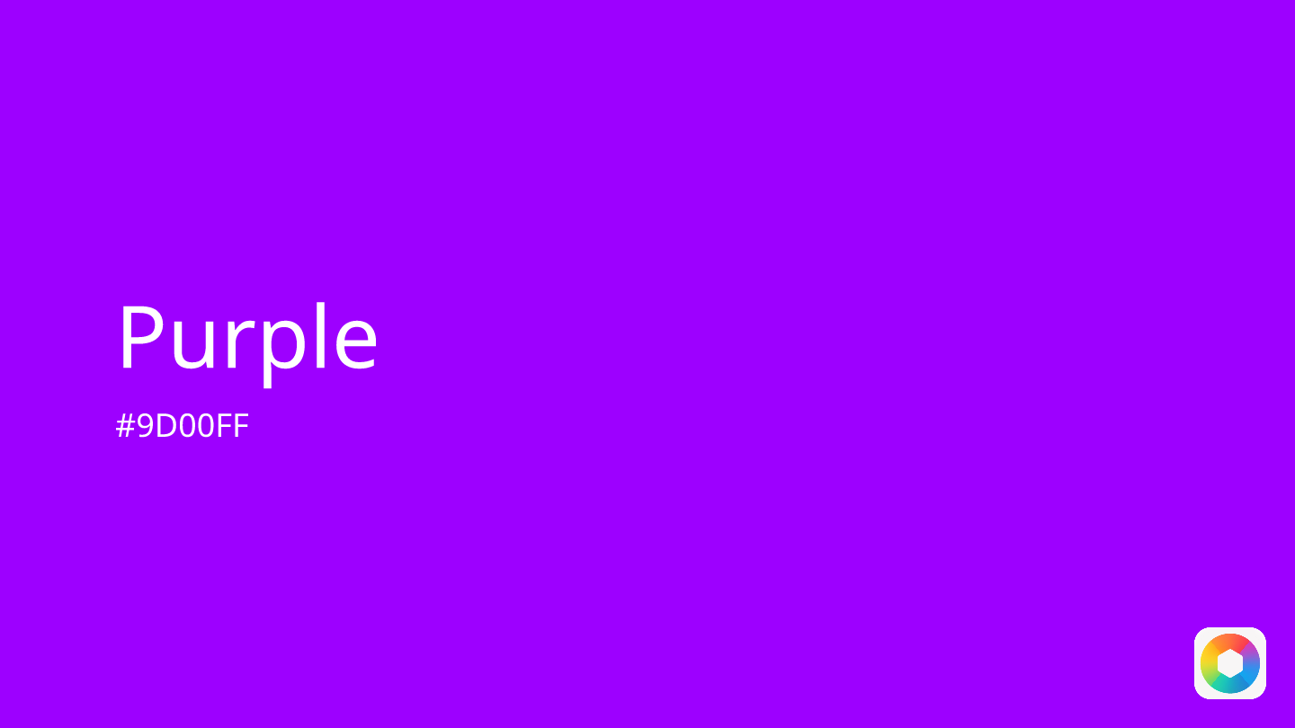
Purple
Explore the qualities of Purple.
Learn more
Beige
Explore the qualities of Beige.
Learn more
Claret
Explore the qualities of Claret.
Learn more
Chartreuse
Explore the qualities of Chartreuse.
Learn more