Bright orange
Hex Code, Palettes & Meaning
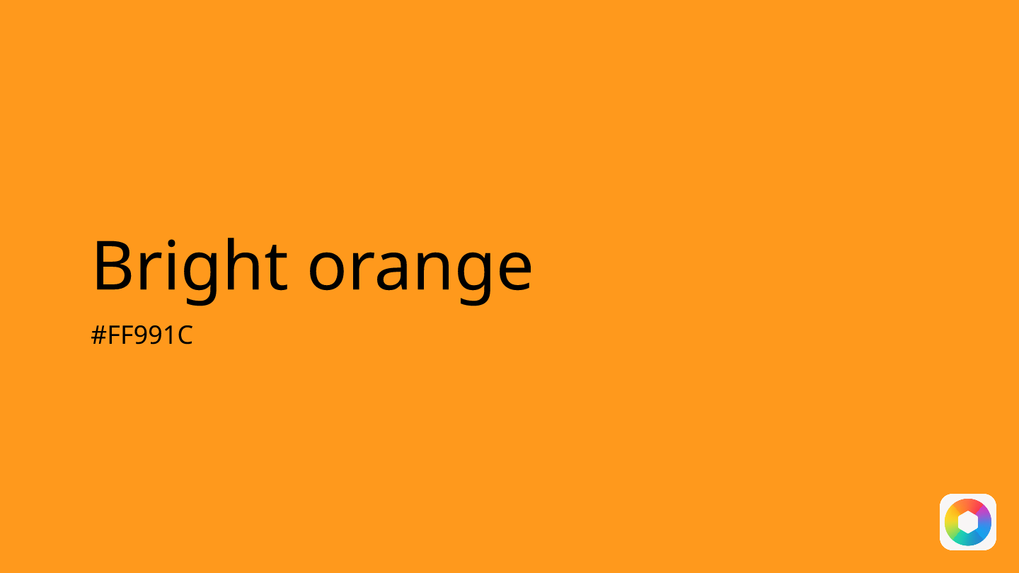
Bright orange (#FF991C) is a vibrant, energetic color with RGB values of 255, 153, 28. This highly saturated hue captures attention instantly, making it perfect for call-to-action buttons, important icons, and elements that need to stand out without the overwhelming intensity of pure red.
In design psychology, bright orange evokes enthusiasm, confidence, and playfulness. It stimulates appetite—which is why food brands like Dunkin' Donuts frequently use it—and creates a sense of urgency while maintaining a welcoming feel. This makes it ideal for fitness apps, children's interfaces, and marketing materials.
Bright orange pairs beautifully with complementary colors like powder blue for summery schemes, pastel yellow for sunshine-inspired palettes, or dark green for nature-themed designs. For monochromatic variations, consider tangerine for a softer approach or burnt orange for deeper richness.
Accessibility matters with bright orange—ensure sufficient contrast ratios when pairing with text. While it's excellent for drawing focus to key elements, use it strategically to avoid overwhelming users. This color works particularly well in small doses as accent elements rather than dominant background colors.
Images with Bright orange color


Color Palettes
Complementary
Split
Monochromatic
Analogous
Triadic
Hex
#FF991C
RGB
255,153,28
HSB
33, 89%, 100%
HSL
33, 100%, 55%
Other Colors
Verdigris
Explore the qualities of Verdigris.
Learn more
Blue-green
Explore the qualities of Blue-green.
Learn more
Blue
Explore the qualities of Blue.
Learn more
Mocha
Explore the qualities of Mocha.
Learn more
Dark cyan
Explore the qualities of Dark cyan.
Learn more
Periwinkle
Explore the qualities of Periwinkle.
Learn more