Powder blue
Hex Code, Palettes & Meaning
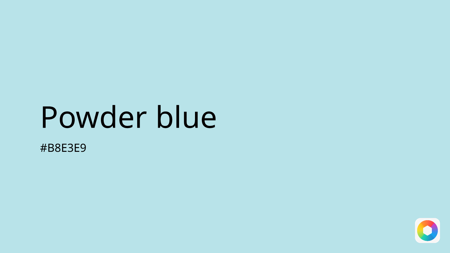
Powder blue (#B8E3E9) embodies tranquility and sophistication in the world of color design. This soft, muted shade combines the calming properties of blue with subtle green undertones, creating a versatile hue that works beautifully across digital and physical design applications.
In UI/UX design, powder blue excels at promoting relaxation and trust – making it ideal for wellness apps, meditation platforms, and healthcare interfaces. The color naturally reduces anxiety, which is why many designers choose it for error messages and notifications, providing a friendlier alternative to harsh warning colors.
Historically, powder blue originated from smalt – a deep blue glass ground into powder that was used to create lighter blue pigments. The color name was officially documented in 1894 and gained mainstream popularity in the 1970s through sports uniforms, particularly with teams like the Los Angeles Chargers.
For color pairings, powder blue harmonizes beautifully with blush pink for a soft, romantic palette, or with ecru for beachy, serene vibes. When you need more contrast, bright yellow creates an energetic, playful combination while maintaining powder blue's calming foundation.
Whether used in winter-themed designs or as a primary brand color, powder blue's timeless appeal and psychological benefits make it a reliable choice for creating trustworthy, approachable visual experiences.
Color Palettes
Complementary
Split
Monochromatic
Analogous
Triadic
Hex
#B8E3E9
RGB
184,227,233
HSB
187, 21%, 91%
HSL
187, 53%, 82%
Other Colors
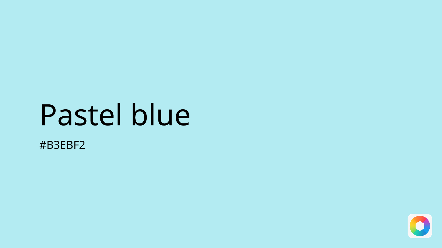
Pastel blue
Explore the qualities of Pastel blue.
Learn more
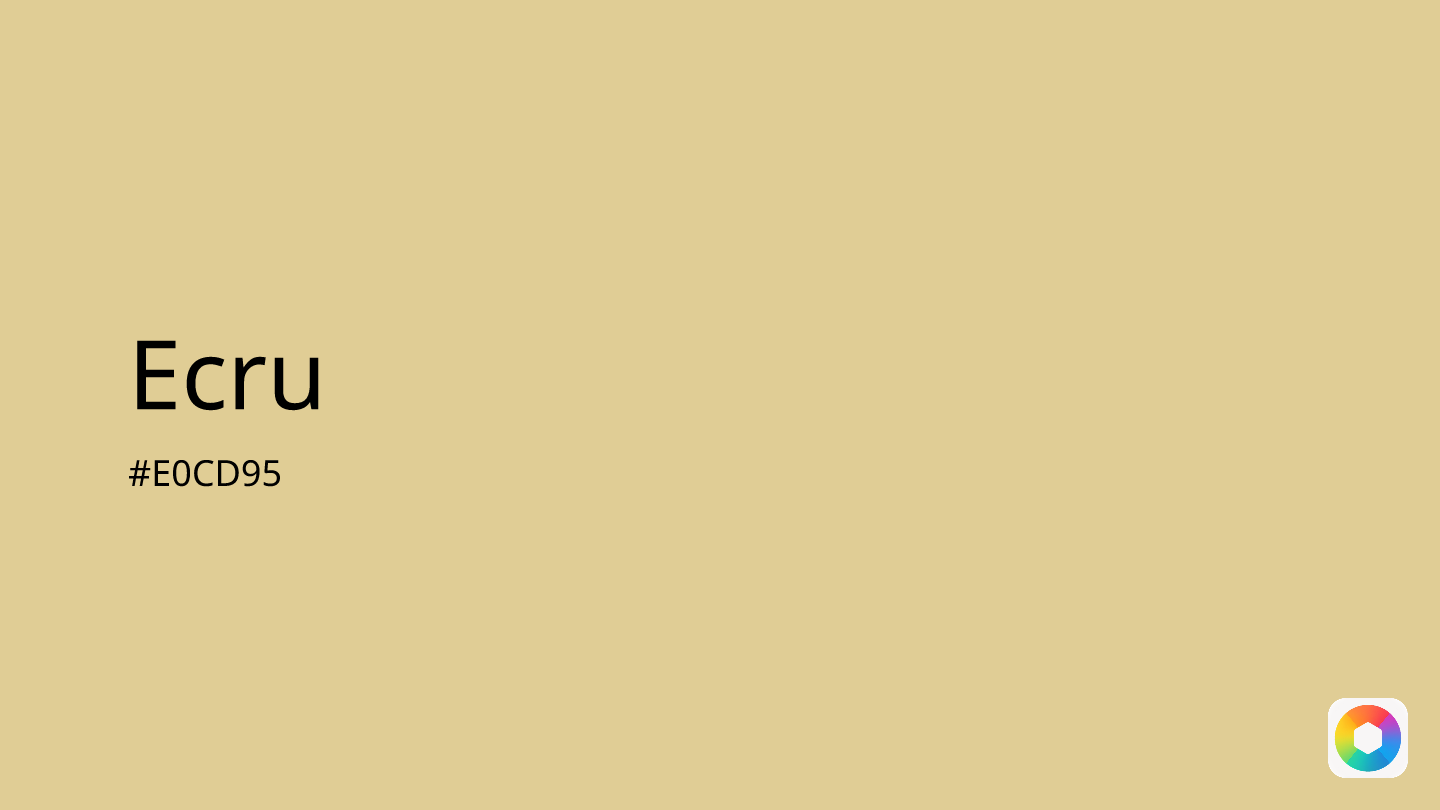
Ecru
Explore the qualities of Ecru.
Learn more
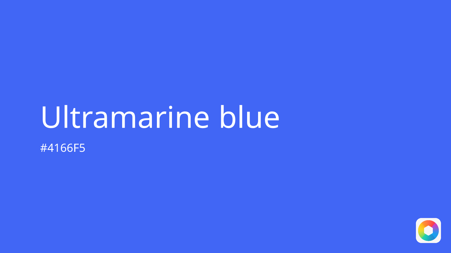
Ultramarine blue
Explore the qualities of Ultramarine blue.
Learn more

Cool gray
Explore the qualities of Cool gray.
Learn more
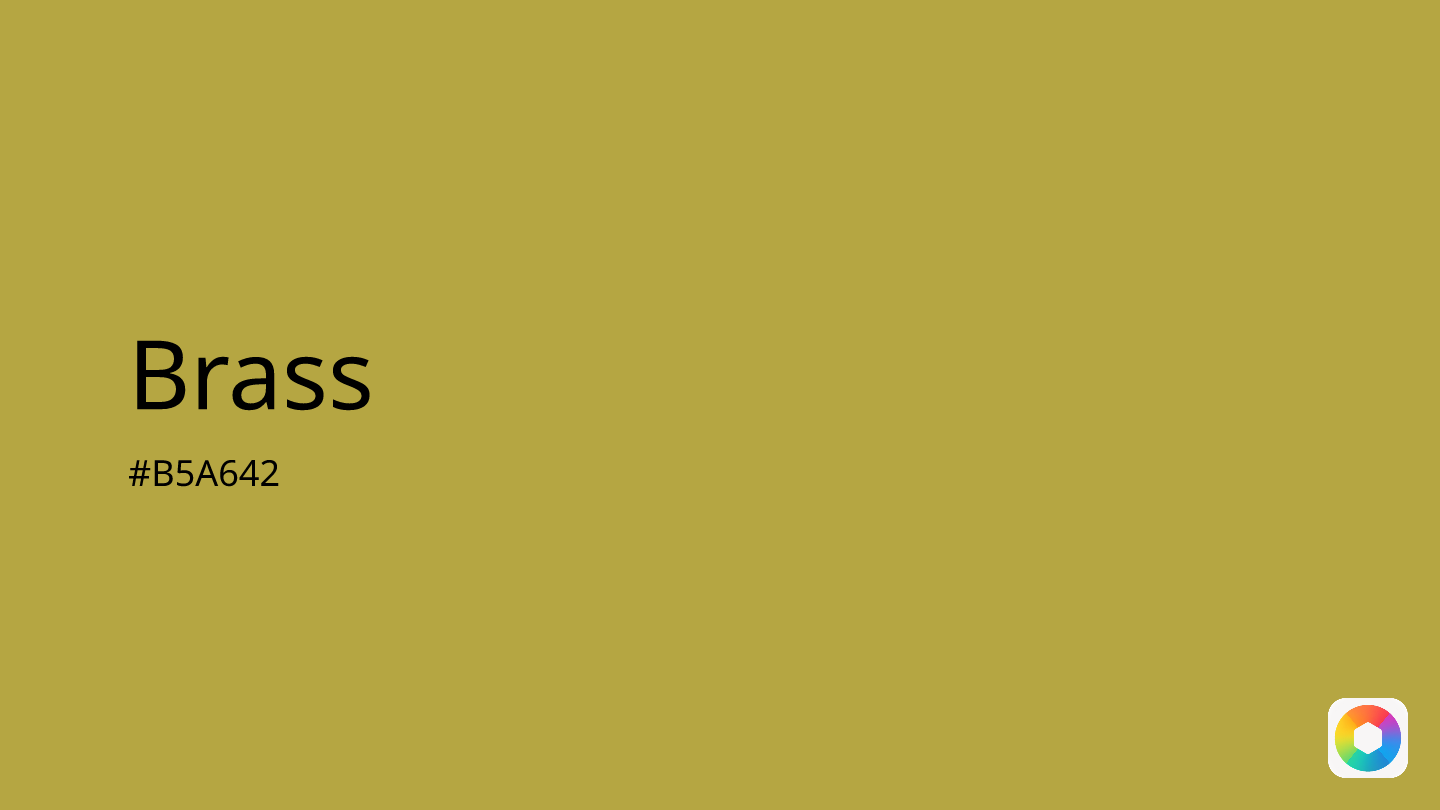
Brass
Explore the qualities of Brass.
Learn more
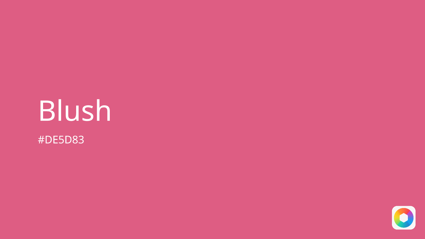
Blush
Explore the qualities of Blush.
Learn more
