Pastel blue
Hex Code, Palettes & Meaning
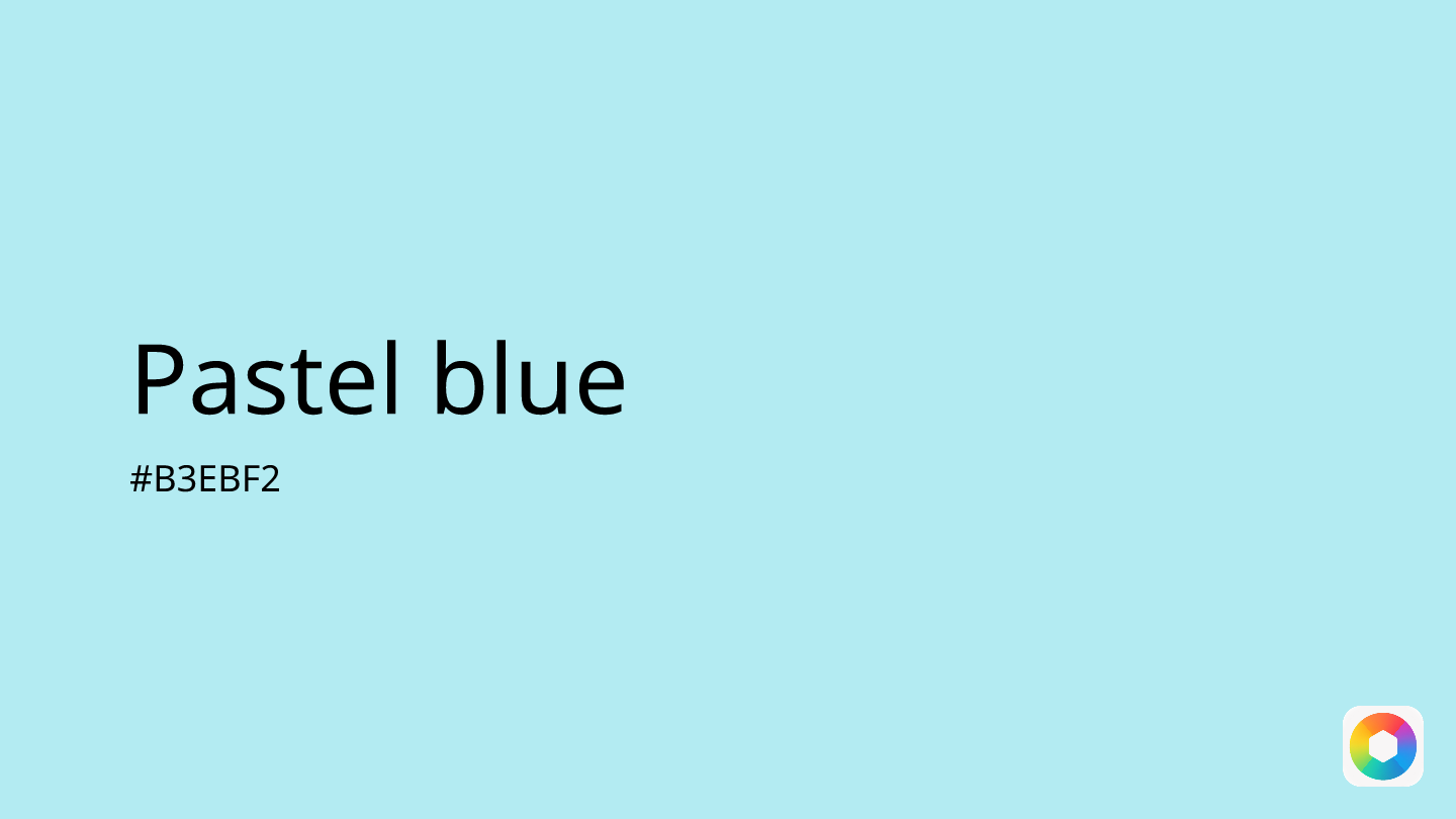
Pastel blue (#B3EBF2) is a delicate, muted shade that captures the essence of tranquility and sophistication. This soft cyan-tinged color brings an instant sense of calm to any design, making it perfect for backgrounds, UI elements, and branding that aims to convey serenity and trust.
This versatile hue works beautifully in large proportions without overwhelming the viewer, making it ideal for website backgrounds, app interfaces, and interior spaces. Its psychological associations with peace and reliability make it particularly valuable for healthcare, wellness, and professional service brands.
Pastel blue pairs harmoniously with complementary shades like ivory and cream for a clean, minimal aesthetic. For more dynamic palettes, consider combining it with pastel pink or lavender to create romantic, dreamy color schemes. The color also works well with warmer neutrals like light gray and champagne.
In digital design, pastel blue excels at creating subtle borders, highlighting input fields, and organizing content without demanding attention. Its gentle nature makes it accessible and inclusive, appealing across demographics while maintaining a contemporary, sophisticated feel that's both timeless and on-trend.
Images with Pastel blue color


Color Palettes
Complementary
Split
Monochromatic
Analogous
Triadic
Hex
#B3EBF2
RGB
179,235,242
HSB
187, 26%, 95%
HSL
187, 71%, 83%
Other Colors
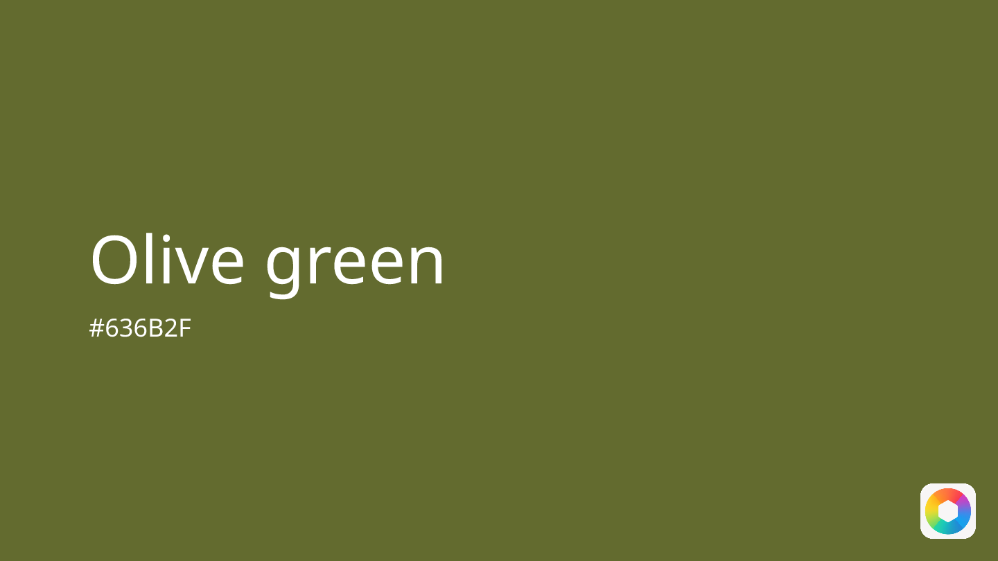
Olive green
Explore the qualities of Olive green.
Learn more
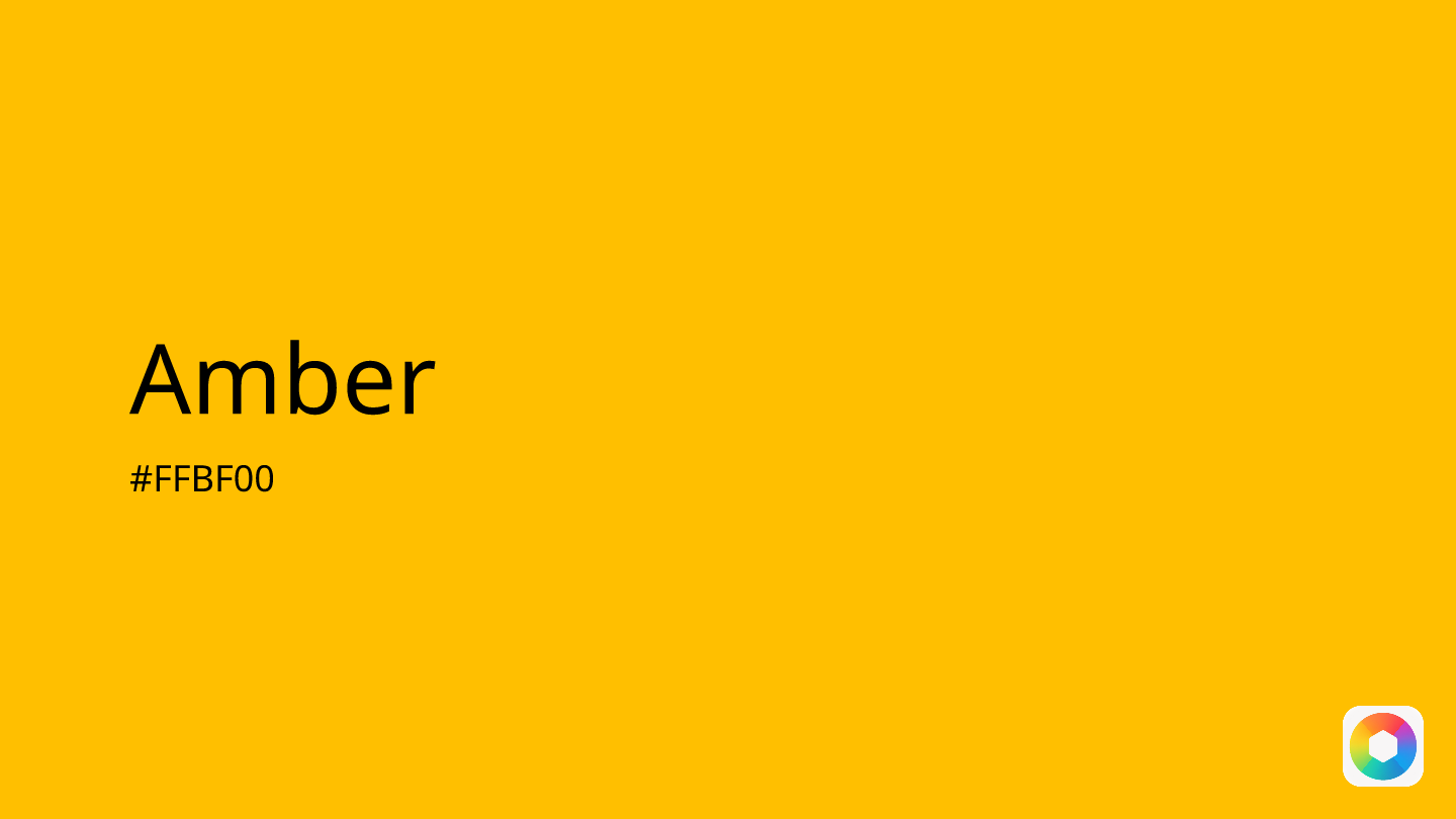
Amber
Explore the qualities of Amber.
Learn more
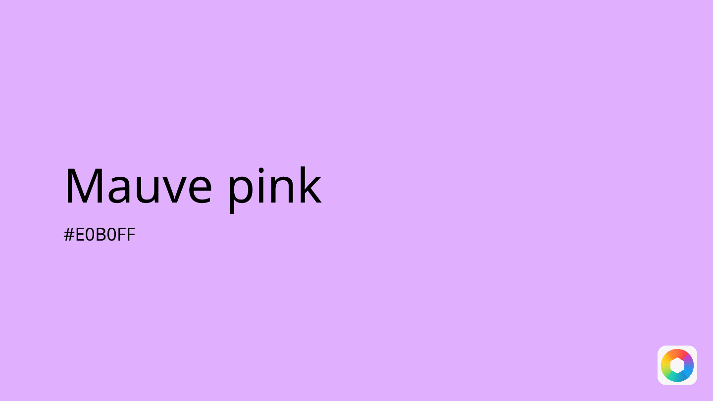
Mauve pink
Explore the qualities of Mauve pink.
Learn more
Bordeaux
Explore the qualities of Bordeaux.
Learn more
Carnelian
Explore the qualities of Carnelian.
Learn more
Razzmatazz
Explore the qualities of Razzmatazz.
Learn more