Pastel pink
Hex Code, Palettes & Meaning
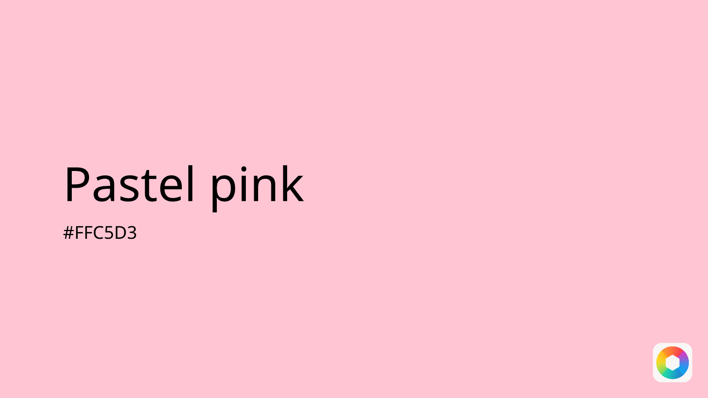
Pastel pink (#FFC5D3) is a soft, delicate shade that brings warmth and tranquility to any design. This gentle hue combines the energy of red with the purity of white, creating a color that feels both comforting and inviting.
In UI/UX design, pastel pink excels at creating welcoming interfaces without overwhelming users. It works beautifully for backgrounds, subtle hover effects, and highlighting interactive elements while maintaining visual balance. The color's calming properties make it perfect for apps dealing with wellness, lifestyle, or children's content.
Pastel pink pairs wonderfully with complementary colors like mint green for a fresh spring palette, light purple for dreamy combinations, or cream for elegant, sophisticated designs. For contrast, try pairing it with navy blue or charcoal.
Historically unisex, pastel pink gained feminine associations in the 1980s but has evolved into a versatile color that transcends gender boundaries. Today, it's widely used in branding for its ability to convey approachability, playfulness, and emotional warmth—making it a smart choice for brands seeking broad appeal.
Images with Pastel pink color


Color Palettes
Complementary
Split
Monochromatic
Analogous
Triadic
Hex
#FFC5D3
RGB
255,197,211
HSB
346, 23%, 100%
HSL
346, 100%, 89%
Other Colors
Blue-gray
Explore the qualities of Blue-gray.
Learn more
Rose
Explore the qualities of Rose.
Learn more
Yellow-orange
Explore the qualities of Yellow-orange.
Learn more
Celeste
Explore the qualities of Celeste.
Learn more
Off-white
Explore the qualities of Off-white.
Learn more
Baby blue
Explore the qualities of Baby blue.
Learn more