Pearl
Hex Code, Palettes & Meaning
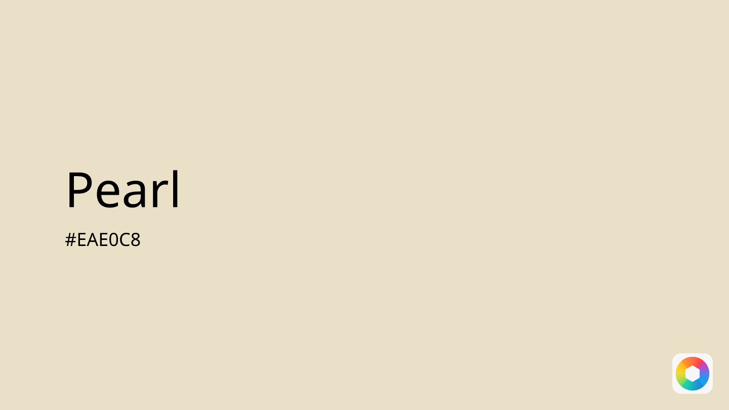
Pearl (#EAE0C8) represents the epitome of understated elegance in color design. This soft, creamy off-white shade captures the lustrous beauty of natural pearls, bringing a subtle iridescent glow to any space or design project.
What sets pearl apart is its remarkable versatility. Unlike stark white, pearl offers warmth and depth while maintaining the light-reflecting properties that make spaces feel larger and more open. Interior designers frequently turn to pearl for creating sophisticated, timeless backgrounds that won't compete with other design elements.
Psychologically, pearl evokes feelings of purity, tranquility, and sophistication. It's particularly effective in bedrooms, bathrooms, and living spaces where relaxation is key. The color works beautifully with both warm and cool palettes – pair it with forest green for natural harmony, dusty rose for romantic elegance, or slate gray for modern sophistication.
In digital design, pearl serves as an excellent neutral backdrop for websites, apps, and branding materials where you want subtle warmth without overwhelming content. Its RGB values (234, 224, 200) ensure excellent readability when paired with darker text colors.
Whether you're designing a serene spa-like bathroom, creating elegant wedding invitations, or developing a luxury brand identity, pearl offers the perfect balance of warmth and restraint that speaks to refined taste and timeless appeal.
Color Palettes
Complementary
Split
Monochromatic
Analogous
Triadic
Hex
#EAE0C8
RGB
234,224,200
HSB
42, 15%, 92%
HSL
42, 45%, 85%
Other Colors
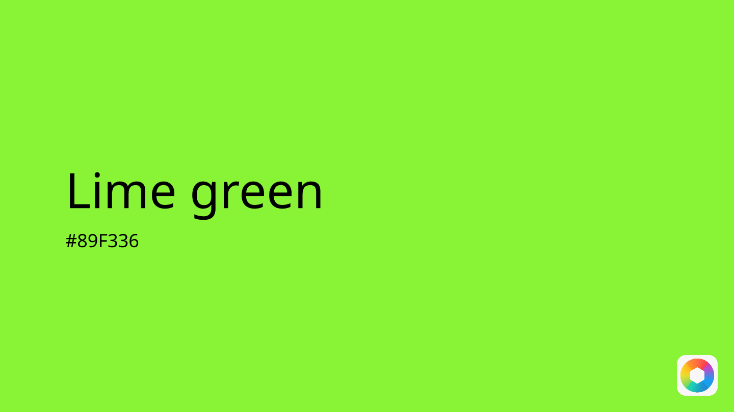
Lime green
Explore the qualities of Lime green.
Learn more
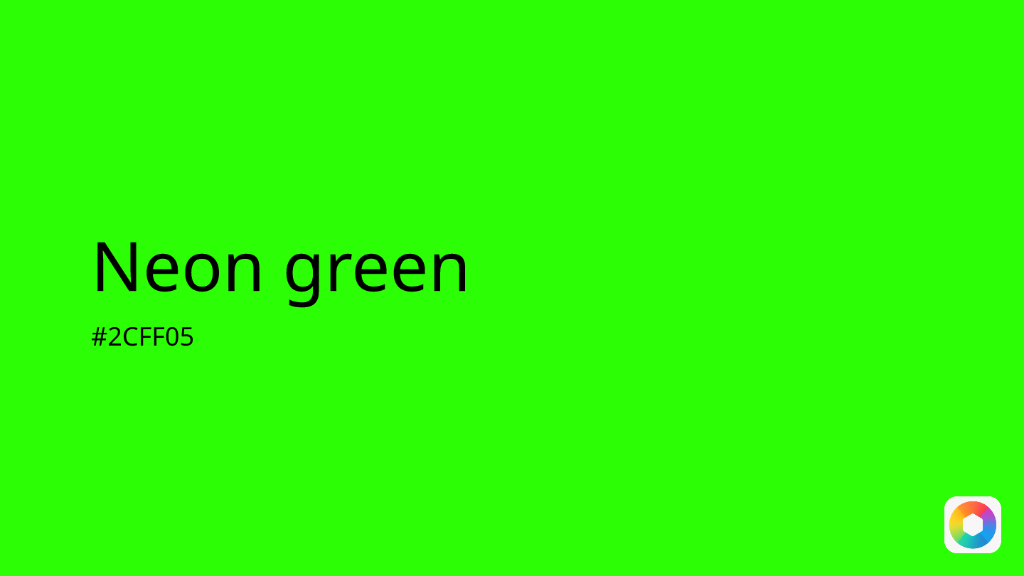
Neon green
Explore the qualities of Neon green.
Learn more
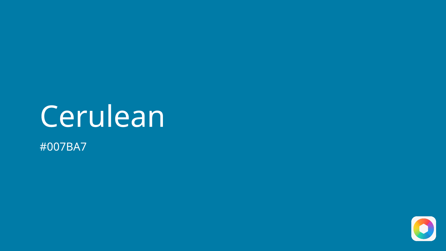
Cerulean
Explore the qualities of Cerulean.
Learn more
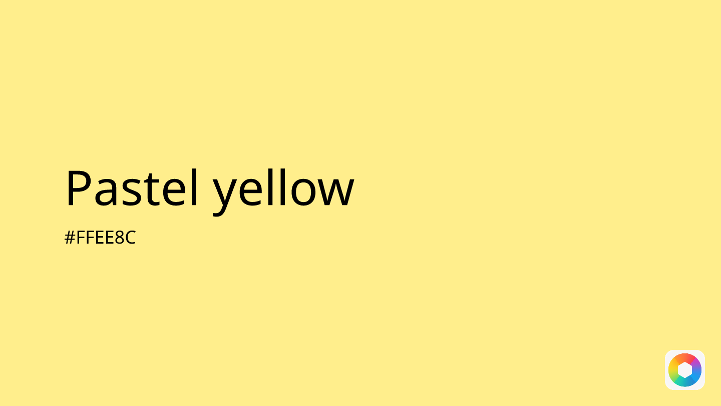
Pastel yellow
Explore the qualities of Pastel yellow.
Learn more

Salmon pink
Explore the qualities of Salmon pink.
Learn more
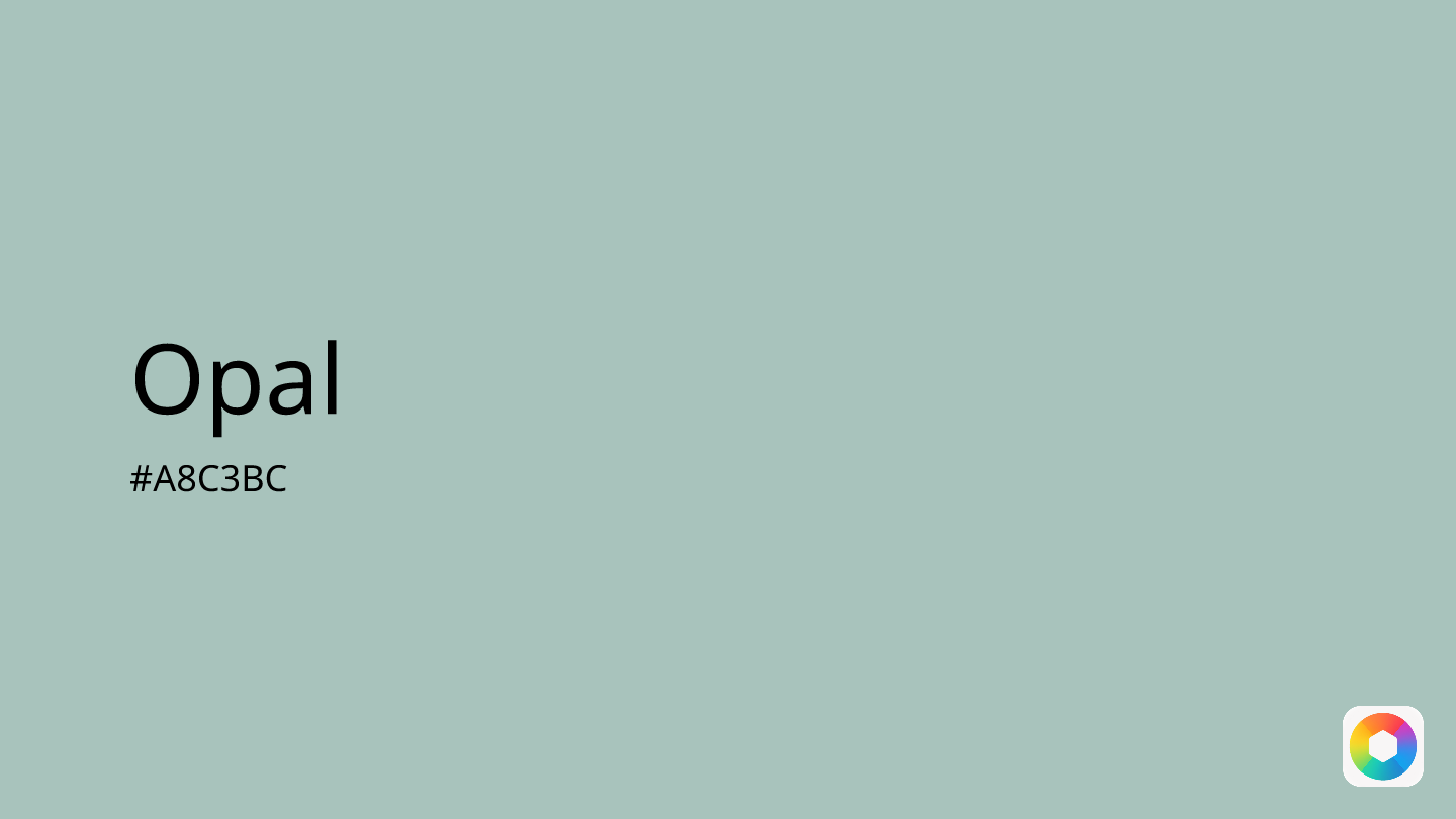
Opal
Explore the qualities of Opal.
Learn more

