Pear
Hex Code, Palettes & Meaning
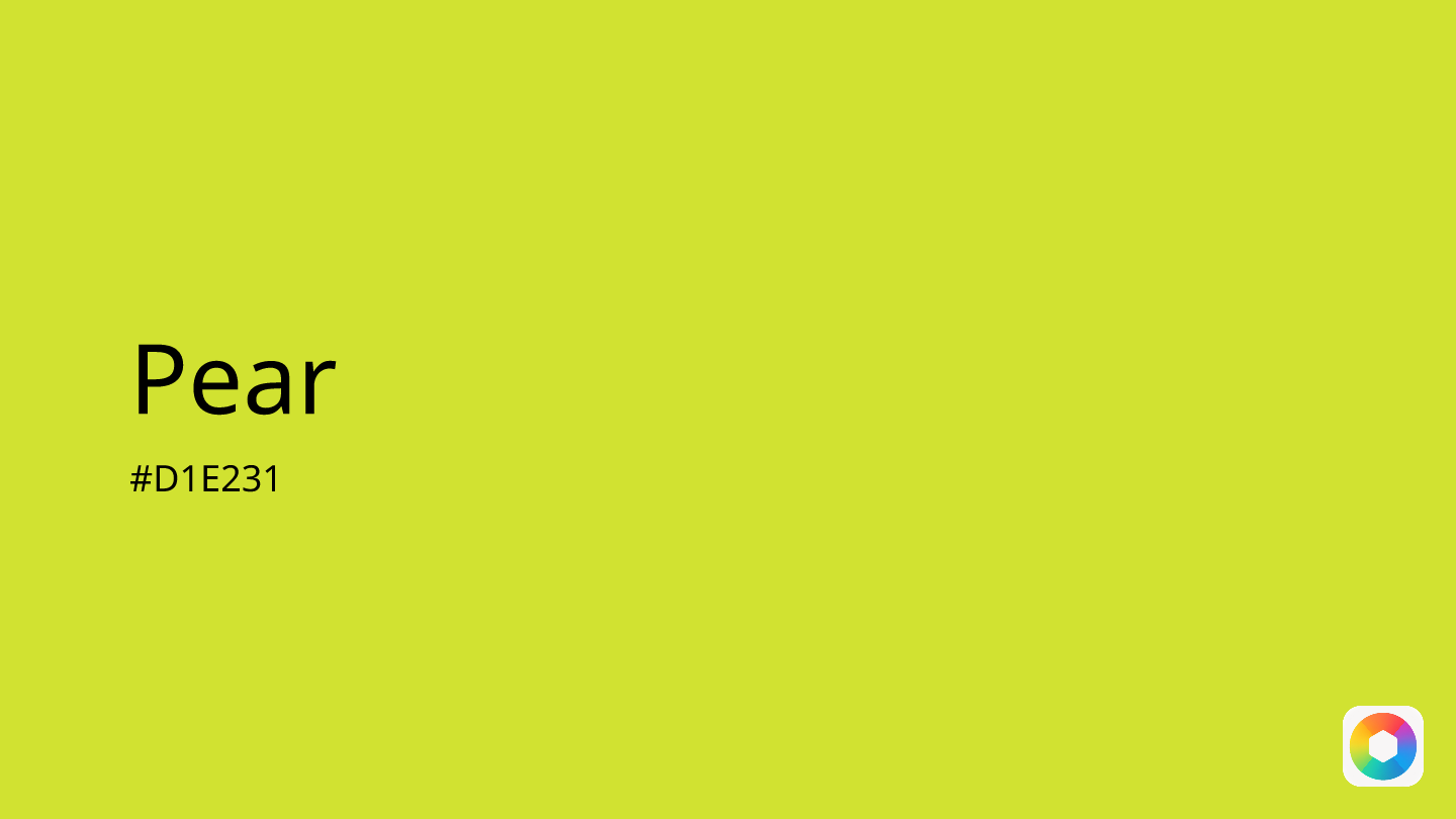
Pear (#D1E231) is a vibrant yellow-green hue that perfectly captures the essence of a ripe fruit hanging from a tree branch. This energizing color combines the cheerfulness of yellow with the natural serenity of green, creating a fresh and optimistic shade that breathes life into any design.
In color psychology, pear promotes feelings of renewal, growth, and vitality. Its natural associations make it ideal for eco-friendly brands, wellness products, and nature-inspired designs. The color strikes a perfect balance between the mental stimulation of yellow and the calming properties of green, making it both energizing and harmonious.
Designers often use pear as an accent color to inject freshness into layouts or pair it with complementary shades like navy blue for striking contrast, or lavender for gentle harmony. Its versatility shines in spring campaigns, organic product packaging, and modern minimalist designs where a pop of natural energy is needed.
While pear works beautifully with earthy tones like chocolate and sage, it may clash with intense warm colors. This refreshing hue embodies the perfect marriage of nature's vitality and optimistic energy, making it a powerful tool for conveying growth, health, and positive transformation in visual communications.
Images with Pear color


Color Palettes
Complementary
Split
Monochromatic
Analogous
Triadic
Hex
#D1E231
RGB
209,226,49
HSB
66, 78%, 89%
HSL
66, 75%, 54%
Other Colors
Neon purple
Explore the qualities of Neon purple.
Learn more
Raspberry
Explore the qualities of Raspberry.
Learn more
Celadon
Explore the qualities of Celadon.
Learn more
Metallic gold
Explore the qualities of Metallic gold.
Learn more
Honeysuckle
Explore the qualities of Honeysuckle.
Learn more
Mint blue
Explore the qualities of Mint blue.
Learn more