Bright red
Hex Code, Palettes & Meaning

Bright red (#EE4B2B) is an energetic powerhouse that commands immediate attention in any design. This vibrant hue combines the passionate intensity of pure red with heightened luminosity, creating a color that literally makes hearts race faster and triggers physiological responses.
In design applications, bright red excels as an accent color for call-to-action buttons, urgent notifications, and elements requiring instant user engagement. Its psychological impact promotes quick decision-making and creates a sense of urgency—which explains why major brands like Coca-Cola and Netflix leverage similar vibrant reds to evoke excitement and enthusiasm.
The key to using bright red effectively lies in restraint. Too much can overwhelm users and create visual fatigue, while strategic placement draws the eye precisely where you want it. Pair bright red with neutral colors like cream, light gray, or white to prevent overpowering other elements.
For complementary schemes, consider teal or aqua to create striking contrast, or coral and salmon pink for warmer, harmonious palettes. Avoid pairing with equally intense colors like neon green or electric blue, which compete for attention.
Remember that bright red's cultural associations vary globally—while Western cultures connect it with passion and love, other regions may interpret it differently, making cultural research essential for international projects.
Color Palettes
Complementary
Split
Monochromatic
Analogous
Triadic
Hex
#EE4B2B
RGB
238,75,43
HSB
10, 82%, 93%
HSL
10, 85%, 55%
Other Colors
Turquoise blue
Explore the qualities of Turquoise blue.
Learn more

Celadon
Explore the qualities of Celadon.
Learn more
Mustard yellow
Explore the qualities of Mustard yellow.
Learn more

Hot magenta
Explore the qualities of Hot magenta.
Learn more
Heliotrope
Explore the qualities of Heliotrope.
Learn more
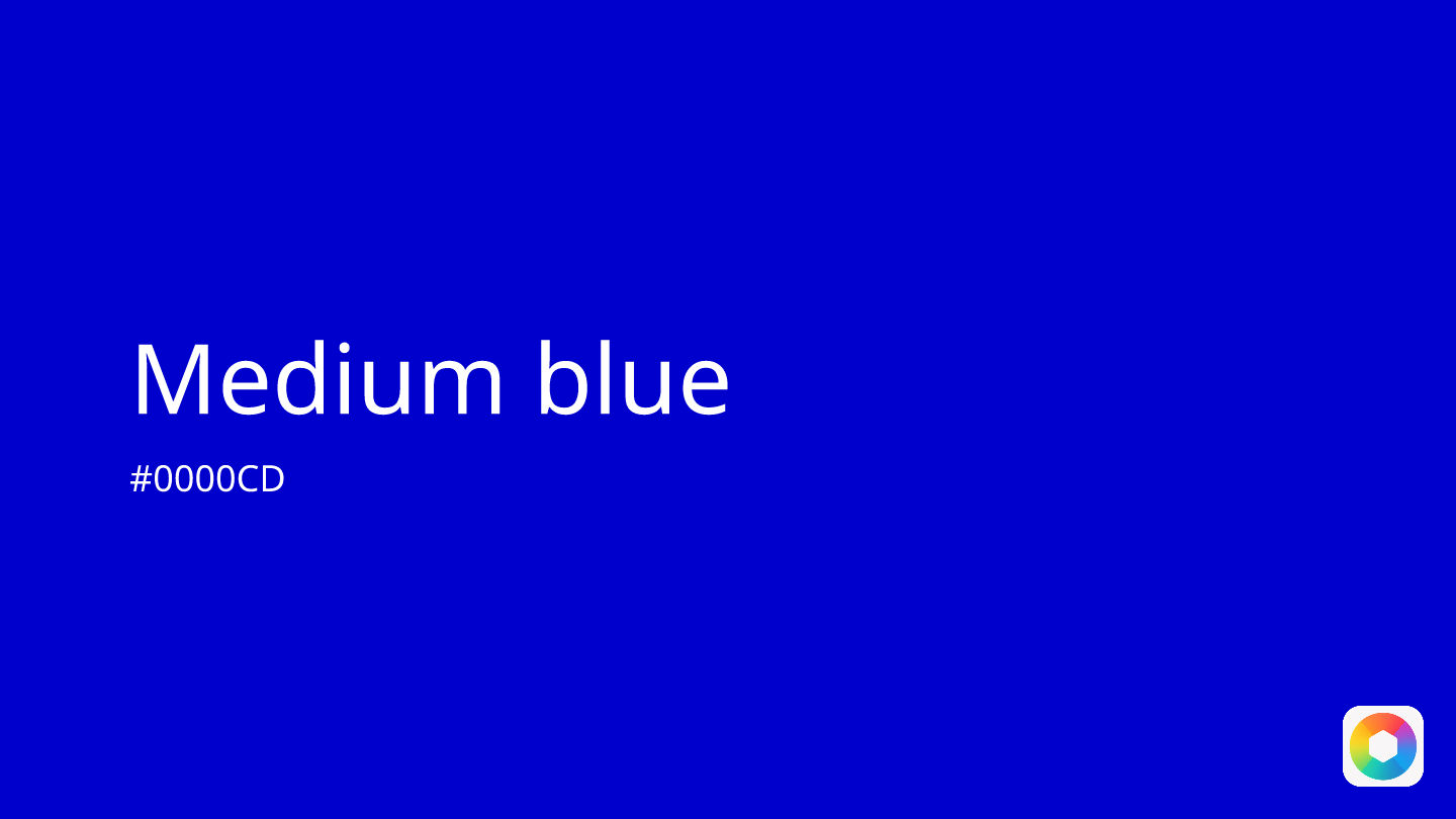
Medium blue
Explore the qualities of Medium blue.
Learn more
