Crimson red
Hex Code, Palettes & Meaning
Crimson red (#B22222) is a bold, passionate shade that combines the intensity of pure red with subtle purple undertones. This rich, saturated color commands attention and creates an immediate emotional impact in any design.
As a versatile color for digital design, crimson red excels at drawing focus to critical elements like call-to-action buttons, error messages, and important notifications. Its natural ability to evoke urgency makes it perfect for encouraging user interaction and creating memorable brand experiences.
When building color palettes, crimson red pairs beautifully with neutral tones like beige and light gray for sophisticated combinations. For more dramatic contrasts, consider pairing it with navy blue or dark green. Avoid combining crimson red with bright neons like chartreuse or electric blue, as these create visual conflicts.
Psychologically, crimson red represents passion, power, and sophistication. However, use it thoughtfully—too much crimson can overwhelm users or trigger feelings of danger. In RGB values, crimson red breaks down to R:178, G:34, B:34, making it highly saturated with minimal green and blue components.
For related shades, explore ruby for deeper richness, chili red for more orange warmth, or burgundy for elegant sophistication.
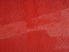
Images with Crimson red color


Color Palettes
Complementary
Split
Monochromatic
Analogous
Triadic
Hex
#B22222
RGB
178,34,34
HSB
0, 81%, 70%
HSL
0, 68%, 42%
Other Colors
Rusty red
Explore the qualities of Rusty red.
Learn more
Slate blue
Explore the qualities of Slate blue.
Learn more
Light gray
Explore the qualities of Light gray.
Learn more
Blue violet
Explore the qualities of Blue violet.
Learn more
Goldenrod
Explore the qualities of Goldenrod.
Learn more
Zaffre
Explore the qualities of Zaffre.
Learn more